7 Paint Color Mistakes (And How to Avoid Them)
1. Choose the Right Undertone
Going for a specific paint color may sound easy, but finding one that doesn't reflect an undertone of blue or red is actually a challenge. This is why people often realize too late that their newly painted "neutral earth tone" room has an unintended mauve, peach or green hue.
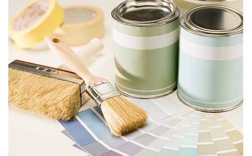
Always compare color swatches next to each other. Undertones become obvious when the colors are side by side.
2. Know Your Paint Sheens
Have you ever walked into a home and noticed that the living room walls seemed a bit glossy? If so, it was probably because someone used a paint with too high of a sheen.
Here are the sheens often recommended by professional painters:
- Low sheen for living rooms and bedrooms. This often translates to eggshell, or "Eg-Shel" in Sherwin Williams paint.
- Satin or semi-gloss for bathrooms and kitchens.
- Flat or matte for ceilings.
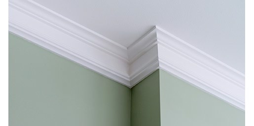
3. Go for Contrast
It's not uncommon to see trim that doesn't stand out as a feature because the wall color is too similar.
The human eye likes lines and contrast (within reason), which is why using a wall color that's different enough to allow the trim to "pop" can immediately bring a room to life.
4. Bring Paint Samples Home
This might just be the most important tip. :) Looking at handfuls of paint swatches at the store can make us feel like a kid in a candy store, but colors often look quite different once they're on the walls.
It's usually worth the extra time (and in the end saves money) to bring home samples and find the color that truly works best for your room's lighting and decor.
5. Use Warmer Colors for Resale
Much of the appeal of a home is subconscious, and design experts often advise that warm colors tend to make rooms feel inviting and comfortable.
While many homes with cool color schemes have enormous appeal, a warm neutral may be the safer route if there's any doubt when painting for sale.
6. Test Paint Colors Near Flooring and Cabinets
The best color in the world still needs to complement the features around it. In addition to testing paint in various light conditions, make sure it looks good near whatever it will border, such as flooring, ceilings and cabinets.
7. Don't Overload on One Color Scheme
Similar color tones can drown each other out when they're on large surfaces that are next to each other. Creating some contrast, even if it means choosing an understated paint color, often results in better visual interest.
Tip: This is easy to overlook when a color frames a window view. For example, if what's seen from the windows is a striking natural environment that's primarily green, using a green paint color on the walls could actually weaken the impact of the view.
Popular Colors for Resale
Kilim Beige
A warm neutral with a tiny hint of red as an undertone. It provides a nice contrast for white trim and often works well for resale.
Softer Tan
Very similar to Kilim Beige but slightly cooler in tone, which makes it a good neutral for rooms that have blue or gray carpeting or decor.
Agreeable Gray
If you're looking for a nice greige that still has a warm undertone, look no further. This is a popular color that pairs well with Sherwin Williams Pure White for ceilings and trim. (According to experts, it's easy to end up using the wrong white with this gray.)
Did You Know?
- Paint usually looks darker after it has dried.
- Carpet usually looks lighter after it has been installed.
That last tip is especially important to note if your carpet has darker flecks in it. The dark will stay dark, but the light background will appear lighter, making the contrast more noticeable once the carpet is intalled in your home.
|