How to Avoid Interior Color Mistakes
Choosing a Paint Color:
The right paint can do wonders to set the mood of a room, but it only takes a little change in hue to have a big effect on the overall result. Here are some helpful tips to know when choosing paint colors.
1. It's all about the undertone!
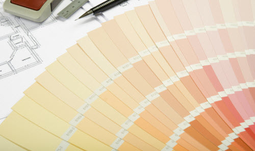
An earth tone is an earth tone, right? Well, yes... but choosing a true earth tone from a myriad of colors that all look like they might be the right one can be confusing.
The best way to find out if you're considering the right color is to compare it to at least five or six very similar shades. Once they're side by side you'll probably see that some of them obviously have very specific undertones - and those may be quite different than what you're going for.
Undertones are especially important with lighter colors. Overlooking this detail is the reason why homeowners who aim for a neutral earth tone sometimes end up with rooms that feel more yellow, peach or blue.
2. Always test paint in your home first.
It's very hard for a paint swatch to convey color accurately, and in addition to that, your home's lighting will affect how it looks on your walls. If you don't want to paint test areas on your walls,
paint large pieces of white cardboard and hold them up to get the same effect.
3. Paint looks darker after it has dried.
You probably knew that, but it's still worth mentioning. :) The final verdict needs to come after the test patch you've painted is completely dry.
4. Higher sheens reflect more light.
A flat or matte paint finish will look slightly darker than the same color in a higher sheen such as eggshell or satin.
Good "Warm Neutral" Colors:
Kilim Beige and Softer Tan by Sherwin Williams are great colors for both everyday living and resale. Although they're quite similar, Kilim Beige is a touch warmer, while Softer Tan can be a better choice when you're coordinating with cool tones such as blue or grey.
Paint Sheen Tip: Eggshell (or "Eg-Shel", if you're using Sherwin Williams) is a pretty safe sheen for walls in most rooms. For kitchens and bathrooms many painters will recommend the next sheen or two higher, whereas for ceilings they usually prefer flat or matte.
Choosing Flooring Colors:
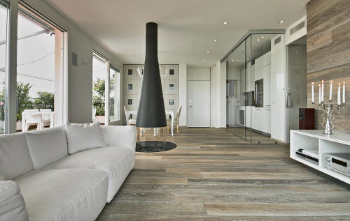
Flooring is always a significant investment, and it's often hard to tell what your top pick is going to look like when it's actually inside your home.
These pointers are helpful to know:
1. Flooring almost always looks lighter when it's installed.
Remember this when you're browsing through small flooring samples at showrooms,
especially if you're considering a style that has both light and dark elements (even if they're just dark flecks on a light carpet). Once the flooring is installed the base color will look lighter but the dark portions probably won't, which means they're likely to stand out even more.
2. See how the flooring looks in both sun
and shade.
This is especially important with carpet because some fibers reflect light better than others.
It can mean the difference between a carpet retaining a lustrous look or taking on a dingy tone when it's in shadow.
Compare samples side by side in sun and shade, and you might be surprised by the differences in what you see.
3. Place flooring samples next to your baseboard.
A color or pattern that looks great in the store might turn out to be
not just quite right when you place it against the baseboard.
Carpet Tip: Upgrading from a 6-lb to an 8-lb pad usually doesn't cost much and can make your carpet feel more luxurious.
Hard Flooring Tip: Use an online flooring viewer tool (available on many flooring websites) to see what your top choice looks like when it covers a large area. This will help you see if the style you're considering will turn out to look too busy or if it's a great match for your space.
Use Contrast to Create "Pop"
 Contrast keeps things interesting and can bring out the best in your color scheme.
 Even though Kilim Beige and Softer Tan are light neutrals, they're dark enough to create a nice contrast with white trim.
If you have wood baseboard you may find that a lighter shade, such as either of those two colors diluted with white to 50% or 75%, works better to create a good color difference with the darker trim.